
Dekora B2B
User research, prototyping, UI design
Reinventing a B2B SaaS with 3,000+ products for 15,000+ users.

Summary
Dekora is a leading manufacturer and distributor of baking and decorating products that's been in business for 40+ years.
This distribution is handled via their B2B Saas platform, which grew quickly in recent years, from about 700 users to handle orders and enquiries for over 15,000, serving their own sales staff as well as distributors, and retailers (big and small), directly or via licensed deals (with a branded skin applied).
The research and discovery phase uncovered many pain points of both vendors and clients. It also helped us assess the problem space, create a plan of work and ideate alternatives/solutions to improve.
We designed a new interface focusing on these and other areas, where we...
- Redesigned the acquisition process: new leads turn into clients faster and with less friction.
- Solved usability problems, focusing on content clarity and ease of use.
- Introduced new functionality and automated tasks, as well as new journeys for Customer Support staff.
- Optimised information architecture and improved visibility of status across the interface.
75%
Shorter time to create and place an order (down from four hours to one)
66%
Quicker to process new leads (from about a week to 36h max.)
90%
Lower drop rate (for new leads) thanks to extended functionality/automation
200
Hours saved (yearly average per person) for Customer Support staff
33%
Fewer item returns and order errors
12.5%
Overall revenue increase
My role
- Research and discovery.
- Journey mappings.
- Ideation, prototyping.
- UI design.
The team
Nuria Aldave (Project Manager),
Elad Rodriguez (Tech Lead),
Paulino Corchero (CTO Dekora), Alejandra Cano (Marketing Dekora), Ivo Muñoz (product visuals),
Roberto Ramos and Moisés Más (Account Management).
About Dekora →
* The actual SaaS B2B platform is only available to distributors
Leading such a challenging project as Dekora B2B next to Alex was a memorable experience. He has the ability to map out critical issues and turn them into simple, scalable flows. The diversity of client/user types and their use cases meant it was a complex operation with many moving parts to it, but his talent to break down those scenarios and turn them into clear, easy solutions made a difference, in keeping stakeholders engaged and delivering an overall leaner product. He's a value-oriented problem solver and an excellent colleague; always willing to collaborate and contribute.
Project Manager
The long read
You made it this far? Keep reading ↓
1. Exploring the problem space and planning the work
In order to define the problem space and find out more, we ran stakeholder mapping sessions, diving deep into internal workflows, user types, permissions, journeys, touchpoints, etc. The aim was of course capturing processes, tools and people, but also cutlure and context. It was important that different types of stakeholders had a voice to unconver pain points and service gaps, etc.
Secondly, we were lucky to have direct access to different types of clients (distributors, sellers, shop owners, national and abroad) so we booked in-depth interviews with them, to learn all about how they work, their problems, frustrations and workarounds.
Research and sicovery helped us understand context and culture; and some key areas were:
- High drop rate for new leads due to a lenghty sign-up and vetting (credit checks, etc.) process, and lack of direct access.
- Lack of clarity in order status and delivery as well as high friction in creating and placing orders, with high overhead on Customer Support.
- Interface usability problems such as clarity of product availability and pricing,
- The legacy platform had a steep learning curve, having to create and mantain multiple user manuals.
- Lack of communication, process to gather feedback and culture of knowledge management.

↑ Six user personas with different needs and levels of access.

↑ The learning phase was key to uncover pain points and helped us ideate and discover opportunities.
2. Redesigning the process for new leads
The rate of lost new leads was a problem, insofar collaboration between departments was not optimal and there were loose ends in several access journeys. Moreover, it ran on separate systems, and that gap had to be bridged by the staff, at a cost in terms of extra emails and hours.
We mapped the as-is process and redesigned it with the client, to centralise this tasks in the new tool and manage these interactions better. We added things like automatic redirections and alerts: simple failsafes so the client never feels we 'forgot' about the application.
Additionally, we planned a new two-stage process for new clients to sign up: they're now able to browse the catalog from the start, while vetting and approvals run in parallel (before they had to wait several days to hear back and many fell between the cracks) with more transparency.

↑ Prototype to illustrate the basic interaction of the mobile menu.
3. Enhancing customer support
Customer Support staff can now manage all support tickets without leaving the platform, reducing the need to cross-reference multiple emails and making it easier for different colleagues to handle a given ticket.
It now works as a simple chat, with an option to attach files and receive email notifications. We also incorporated WhatsApp for business, providing timely updates for orders and tickets.
All of this greatly reduced the volume of new enquires, with an average of 200 hours saved on support and information to clients.

↑ The platform manages support tickets and enquires can be handled (via product codes) on WhatsApp.
4. A menu with all the shortcuts
The new main Menu moves on from the left handside model to put product and information front and centre, and brings together actions that were scattered across the interface before, enabling users to access everything in a couple of clicks.
One of the reasons to go for a more 'e-commerece site' type of layout with a mega menu (which feels more standard to most) layout vs a typical SaaS one was how learning curves came up in research as a barrier, with functions and tools hard to find in other sub menus and sections.
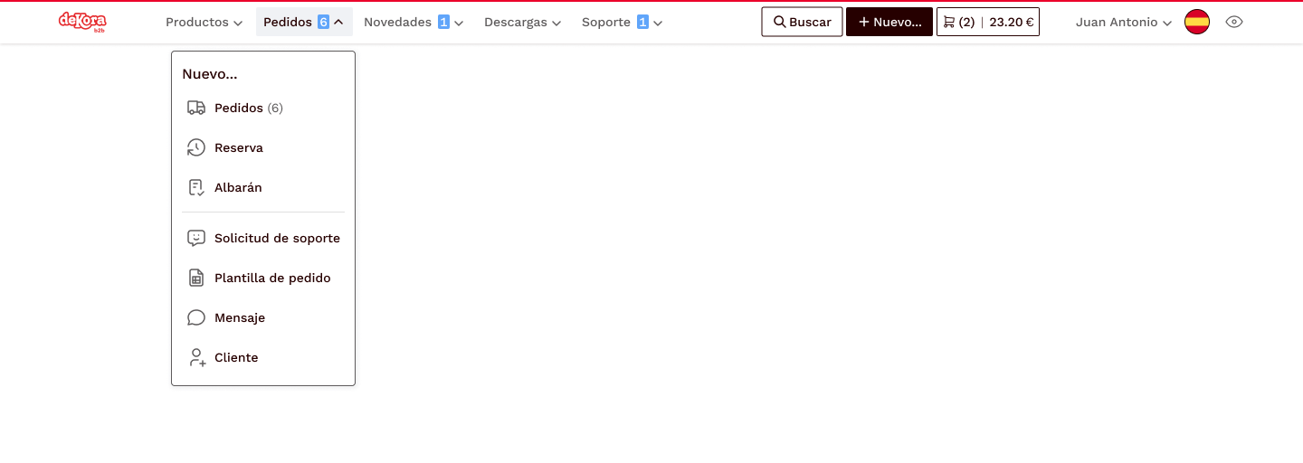


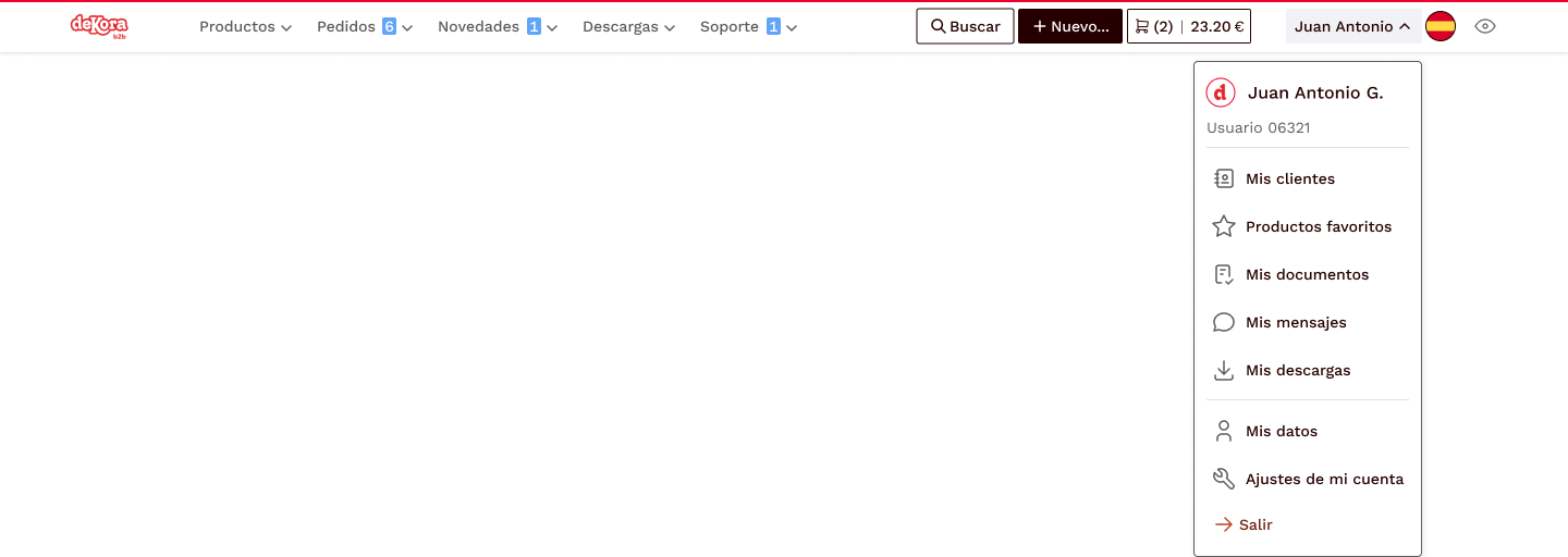

↑ The main Menu frees up screen space and enables users to go anywhere in a couple of clicks.
5. Checkout process improvements
Users highlighted several problems they had when it came to place an order, once products had been selected:
- Adding products to a previous order wasn't easy:
-> we redesigned the flow and also embedded this functionality in the basket preview. - Product availability was not always clear, and they had different leadtimes:
-> we added tags and tooltips on products and listings to filter easily. - Pricing was at times confusing:
-> we included more pricing information (standard vs custom price, discounts, etc.) to reduce ambiguity. - During busy times, product was often gone before clients could purchase and they ended up buying elsewhere:
-> we developed a new 'Booking' functionality, so customers could pre-purchase to ensure future stock without additional storage costs. - Some found placing new orders very challenging and had to create their own workarounds (spreadsheets, etc.) at a great cost. Others spent time training customers on how to do it every time time. Many just reused the same order with minimal changes every time:
-> we added a step in the process where users can create from a pupolated template, upload teir own or re-use a recent one without browsing their files. - It was not always clear whether the order had been placed and the journey stopped abruptly
-> we added move visually appealing completion screens.


↑ The Booking functionality enables cutomers to book stock without the burden of storage costs, and the option to use templates (even your own) decreased the time-to-order singnificantly.
This is a work in progress
I'm currently working on completing this case study and should be finished soon.
7. Outcomes
Behind the scenes, Dekora now runs on a powerful yet light and efficient B2B platform that addresses the painpoints we uncovered during the research stage. We worked hand in hand with the client, as well as with the distributors and other user types, to study how to make their daily tasks easier and better.
In additon to looking into those problems, we were lucky to be abe to ideate and build some new ideas that arose along the way to improve the platform, such as the product booking system, the ready-made templates to ease orders or the embedded tutorials to ease learning efforts for new users, amog many other small improvements with big impacts.
Focus on what matters
The new customisable Dashboard provides a clear overview of all the key figures for each user, with much more practical information, at a glance.
Taxonomy & info architecture
The overall number of categories and product types is much lower, eliminating semi-empty categories and simplifying browsing.
Better support
All tickets can be managed without leaving the platform with a simple chat to communicate and track support tickets easily.
Tracking and updates
Sections like Orders offer richer and more timely information to users.
Things like units vs units per pack as well as standard prices (vs custom and discounts) are consistent, without room for misunderstanding.
Better search
Search offers more relevant search results, plus suggestions for similar and mistyped terms.

↑ The new Dasboard of the redesigned platform.
alexnogues.com 2025-26