UK Visa and Citizenship Application Services
The short read
The UK Government service to apply for Visas and Citizenship had detected several problems with their online processes.
We worked to optimise the main journeys for users as well as content, language, form design and the look of the site, with accessibility and inclusivity in mind.
↓ Read the full story below.
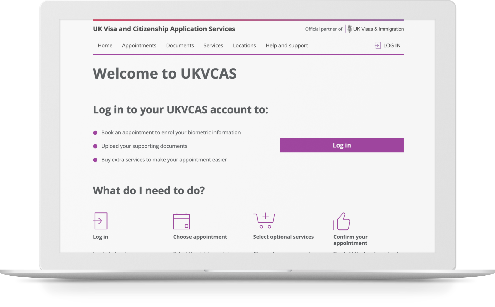
↑ The current UKVCAS website is all about simplicity, within GDS guidelines. Accessible and very focused on user oucomes.
Case study
↓ I joined the UKVCAS team halfway through the project (to support my colleague Colin Mcquistan), and all along our focus was on:
- Streamlining the main service journeys, as well as the overall usability of the site.
- Improving the look of the site, unifying style and imagery within the GDS standards with a focus on user transactions.
So what did we need? We came up with a plan of work by finding out more about user needs.
The scope of users who access these visa services is very wide. We had to keep in mind a wide range of constraints: from the generational, cultural and language-related to the permanent, situational and temporary users face when interacting with the platform.
We designed with accessibility in mind, but also with an inclusive design mindset.
Eventually, we narrowed down the journeys to work on:
- Users have to to log in.
- Users need to book appointments easily and be able to edit choices.
- Users have to prepare for appointments.
- Users need to know how to find help; and if that's not enough, request support from different channels available.
- Users need to know the current status of services (are they running normally?).
- Users can find out about added-value services.
This allowed us to break the journeys down into stories, but to structure the work effectively we needed everyone to be in sync as to what needed doing and prioritising.
We then held a series of workshops with stakeholders on what wasn't adding value and/or was a problem, what could be improved and whether there was room for innovation, then we were able to work together to prioritise and create a useful backlog.
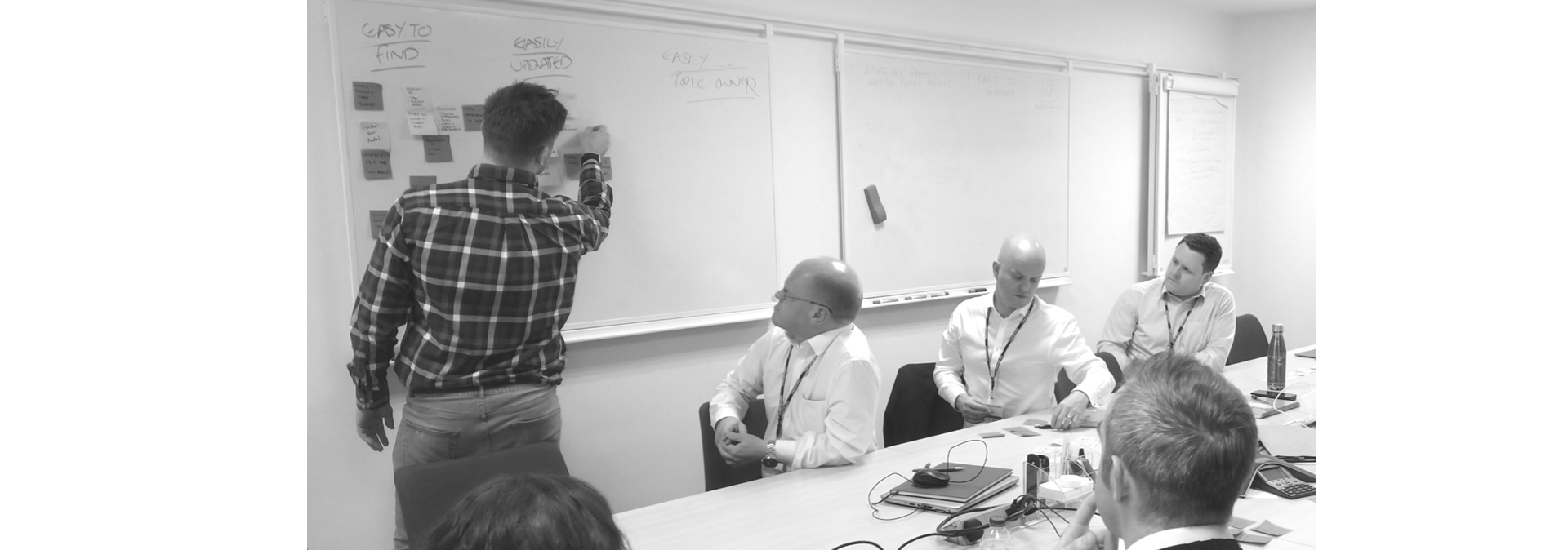
↑ Conducting workshops was essential to build trust, get design buy-in and unify efforts.
More details
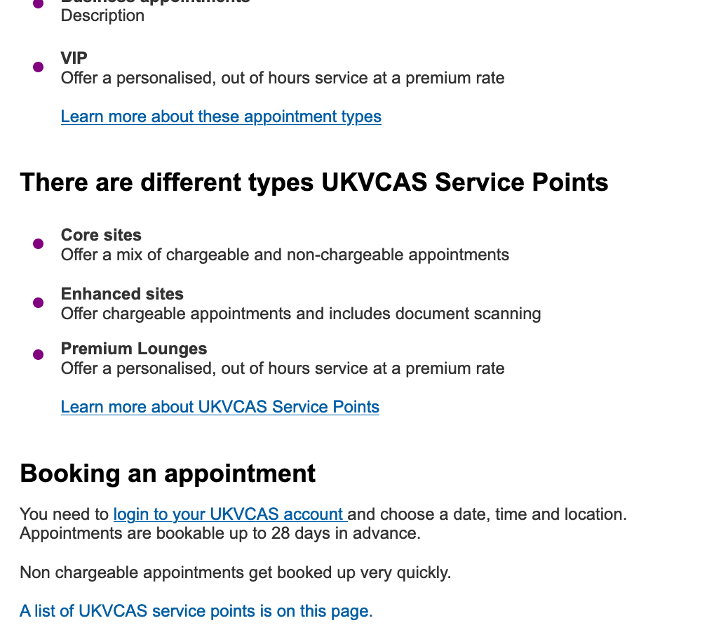
1. Improve information architecture, revise content and unify language.
A content catalogue of which pages needed content and the type of content, split between logged in and logged out pages. We also analysed the content upload system from our side and the end user's.
Language needed consistency, not only in terms of tone and voice but also in terms of labelling across the site (for instance referring to appointments as bookings, etc.).
One of the main goals was to lose pages with duplicated content, and make the site map easier to navigate and memorise by users.
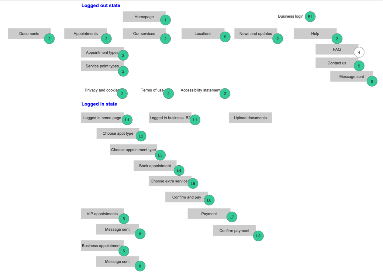
↑ The information architecture was streamlined to focus on what's valuable for users and their goals.
More details
2. Create a new pattern library for a new look.
A new pattern library, documenting the type of components and the scenarios for their intended use. Find a new visual style that would look modern but rather timeless, fresh, clean and minimalistic. This means we needed a distinct look that would at the same time suit the GDS guidelines.
We worked on modernising base components, unify branding and narrow down text styles, etc.
One of the goals with this was to create template pages to make things more efficient (UKVCAS could then create more pages in the future without further design work), and verify that templating was realistic and future-proofed within the existing tech stack.
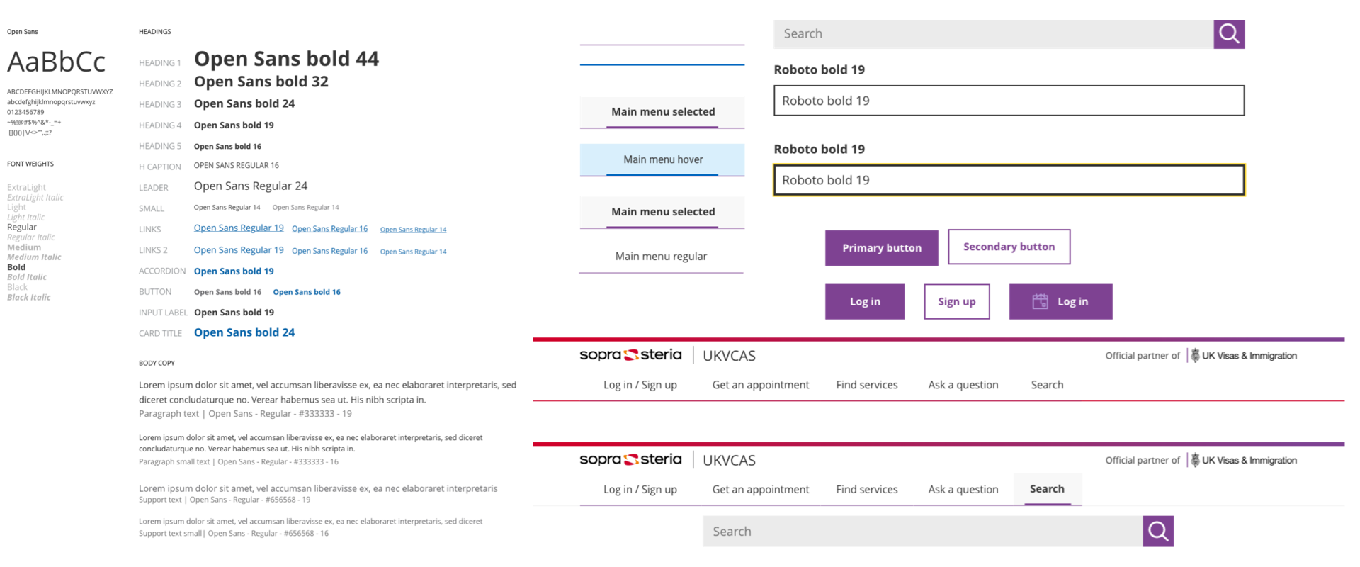
↑ The new pattern library was built for a cleaner, more modern look that would suit different illustration styles.
More details
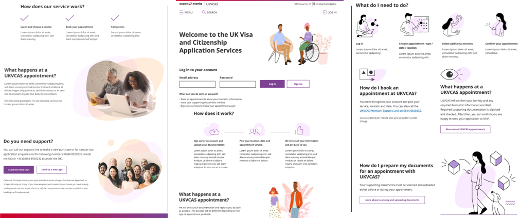
3. reevaluate processes to make them more user-centric
Focusing on the main journeys we described in the backlog, we worked on streamlining processes: things such as preventing errors, improving on-screen information and talking to users in straight, simple and consistent language made users more self-sufficient and decreased dramatically the number of support enquiries.
One of the principles was to always explain to users what things meant, what the next step would entail, why things happened, and what to do to correct things when possible.
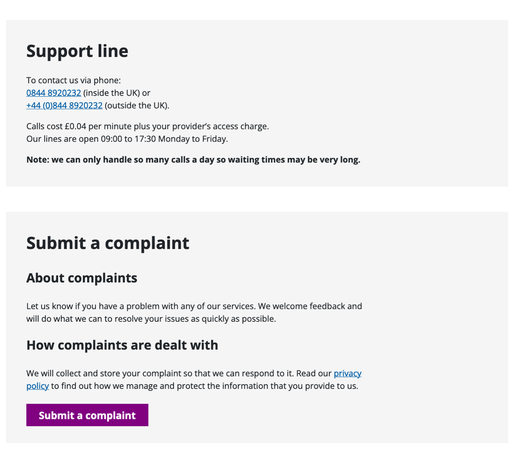
A key part of this was to improve the FAQs. We placed them on the Home for visibility and tweaked them into a dynamic component that would serve the most popular upfront.
UKVCAS transactions can be very critical, so we set out to improve the "next steps" type of info everywhere, addressing the anxiety element that research had found when users would when they didn't know what to expect and when.
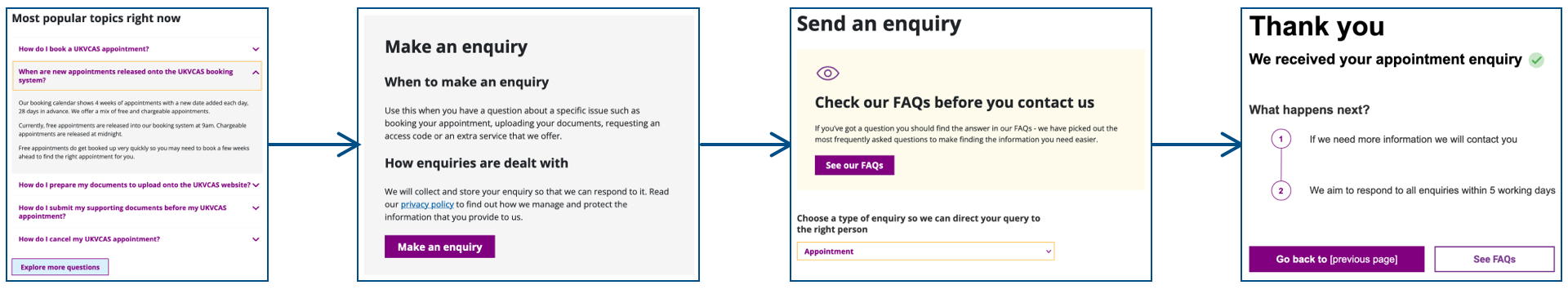
↑ Users would always have action feedback and see info about what came next.
More details
4. Exploring new visual styles for the refreshed pattern library
We looked for something modern, fresh and low-maintenance. Different drafts were evaluated before defaulting to the most minimalist of all. Style and illustrations had to be in line with branding and be scalable (for any future new pages), which means that we should always be able to replicate a visual style in the future with minimal effort.
↑ Some of the discarded designs (images are Low resolution).
More details
5. Provide more hand-holding overall
Some processes appeared quite complex for users, combining area availability for appointments in real time, combined with different levels of service (premium appointments, etc.). It was important to address this by visually guiding users with a simplified UI and better content hierarchy.
The most obvious model to follow here (one that many users would recognise) was that of travel bookings online, using a stepper and a 'slides' calendar for clarity.
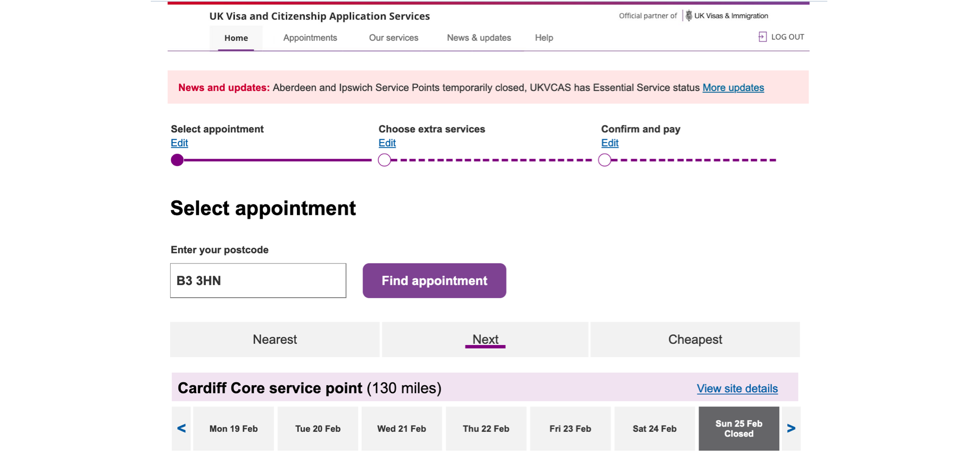
↑ The stepper component helped users navigate the process, and larger dynamic calendars displayed availability more clearly.
More details
↑ Overall, there was a big leap in content clarity and hierarchy.
Did it work?
Things worked out greatly on all the accounts we looked at at the start:
- Support enquiries decreased,
- Lead times (to log in and book an appointment) were shortened,
- Time spent on pages went down (more concise and better structured content).
- Readership increase of the FAQs tell us that users left the site (and presumably attended the appointments) better informed.
- Additionally, the uptake of value-added options also improved slightly!
My role
Information architecture, content design, user interface & component specs/documentation
Thanks to
Colin Mcquistan (UX prototyping)
Links