Vanguard professional investors
The short read
Vanguard is the second largest Asset Management firm in the world. The European part of the organisation wanted to update their Professional Investors (B2B) websites across 14 countries.
We joined efforts through a collaboration framework (with teams from Germany and Australia) to create a European Design System (EDS) that would:
- Achieve consistency, unifying the design language across territories and documenting component use throughly.
- Reducing time-to market: design at scale across the European websites, templifying pages and components.
- Reduce Design costs, alleviating workloads allows Design teams to focus on more complex problems.
- Reduce onboarding costs, increasing efficiency in onboarding new members of the team.
↓ Read the full sroty below.
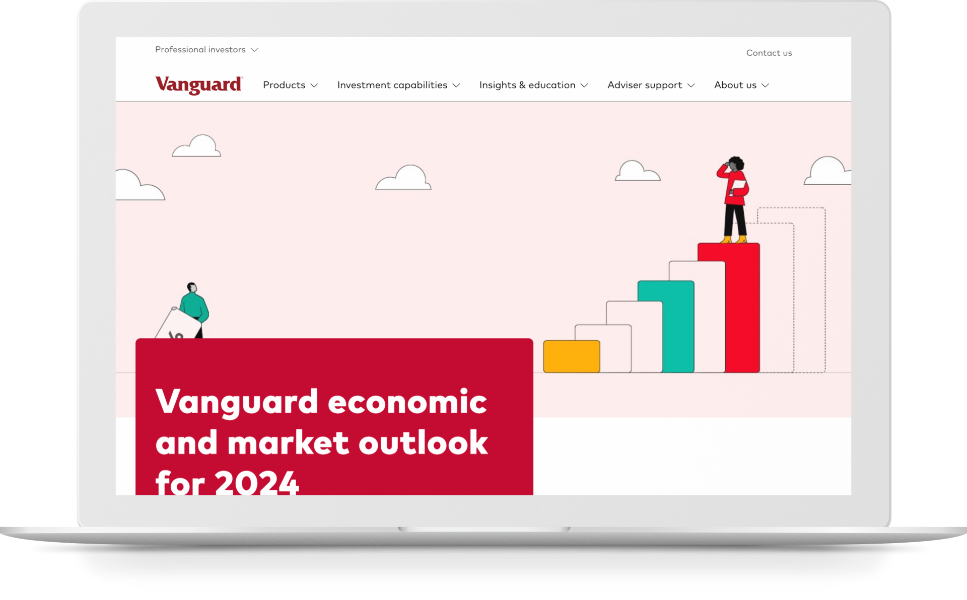
↑ The current Vanguard site.
1. Context
Vanguard maintains 17 websites across Europe. Some of these sites are transactional (investors can buy assets) while others were purely informative (needed to meet regulatory standards).
- Managing and updating each separately was eating up lots of time and reasource, partly because mounting tech debt.
- Not only the look & feel was starting to look dated (rather dull and generic), but a new global branding guide had been issued, and their interface wasn't ready.
- It was accesible, but very text-heavy and it was often hard to find the information users were looking for. Once found, there weren't many visuals to support the content.
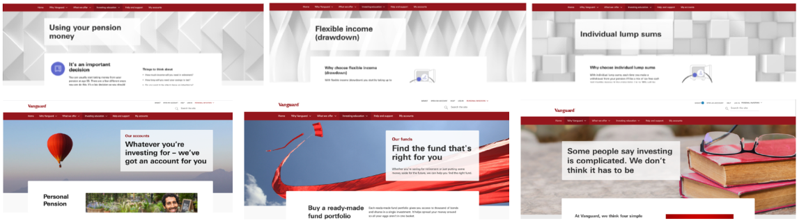
↑ The former interface: generic imagery and patterns didn't help users navigate the content.
2. Collaboration
It seemed the moment to adopt a forward-thinking approach (moving to a React js library), and make things more efficient on the design and content fronts, easing the workload on the Content Team and ensuring any future changes would scale seamlessly.
A renewed component & pattern library would be a source of truth for all teams and would require minimal toing & froing.
This is when Vanguard reached out to Somo (now CI&T) and I was sent in as a Consultant.
Vanguard Australia had spearheaded a design library of components shortly before I was allocated to work on this project. Initially, the idea was to extend this to work for us in Europe, but on a closer look we found that:
- Many components weren't fit for purpose (very specific to products and services offered in Australia, etc), including the typeface set.
- Their library was built in Angular js and we had moved to React js. Things would have to be tweaked or reworked anyway.
Germany had been working in a separate direction for the B2C market and they were just about to launch their mobile app. The US part of the business had its own library, Constellation, but it was very specific and, again, different.
After much delliberation, it was resolved that:
- Close collaboration with Australia or the US would be an uphill journey due to different constraints (availabilty of large teams, priorities, timezones, progress at different stages, etc.
- A similar story (to a lesser extent) with Germany: they had developed independently and if we were to blen in, we would become dependent on their development to make progress later on.
- We wanted to create something solid that would enable changes at scale, independently. A library that would unify the look & feel across many European sites, but in line with the new branding guidelines so it would not come across as dated.
The solution seemed to be: Let's build from the ground up to minimise techincal & Design debt, but le'ts also adapt exisisting components that would be helpful and aligned.
...The question then was: how should we bring it all together?
We needed a framework to give things some structure and to make sure we knew where all the moving pieces should be.
I worked with Vanguard's Designers in Europe (Armando Affonso Michael Russ, Angelo Schiavone) and assembled a collaboration framework to organise how things should be. We then came up with the idea of a "Design Council": a small group that wold work closely to align it all and make decisions quickly and sensibly.
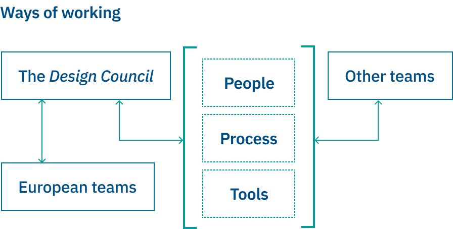
↑ We would have touchpoints with other teams but make sure things would align.
A closer look
We wanted to organise things around People + Tools + Processes. The main points were:
- Team structure organisation (current and new teams).
- Design System Council (regular meetings and decentralised way of managing the design system as a big team).
- Teams and projects strucutre.
- Component structure in teams, projects, and files.
- Component decision trees.
How did we organise this in Figma?
Team types:
Separate team for our design system.
Teams for different countries/markets and business units, and sub-teams for big initiatives within the market (Apps, etc).
Teams for other business departments like Marketing.
Project types:
Projects with multiple files within the same structure.
Product areas or initiatives.
Local Design Libraries.
Design System Council:
Meets at least every two weeks.
Anyone can be a member; at least one member per market (Eur, Aus, US).
Aligned on Time , tools and workflow (dedicated Jira board, etc.).
The Mission of the Council was to:
- Create and enforce strategy and consistency in the system.
- Check that new components, design patterns and styles and their documentation were aligned with the rest of the system.
- Write and review documentation to complete the system.
- Follow up with other markets and assist contribution to the system.
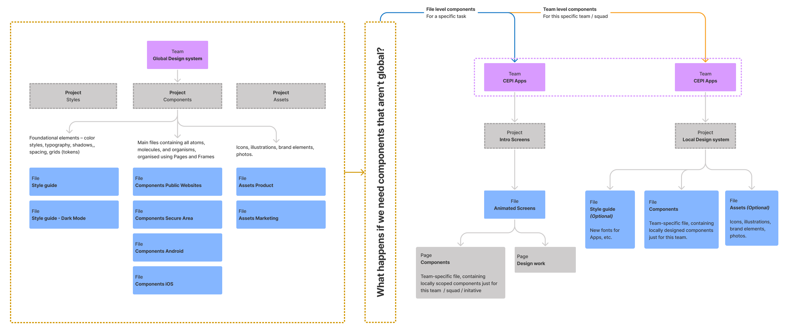
↑ Splitting files into Styles, Components and Assets helped cross-functional teams self-organise.
3. Structure
The next step in setting things up was to:
- Organise a Figma workshop with the engineers (for handover and inspection).
- A workshop with non-designer stakeholders (on how to use it).
- A meeting of each team (with its own engineering team) how to handover and migrate (whithin Figma) to shared libraries, standard labels, etc.
Once this was done, things started to fall into place and we took steps towards setting up the basics.
One of the changes was choosing a flexi grid as opposed to the fixed grid other teams were using, as well as departing from the Linotype Univers or Mark OT typefaces used in previous interfaces and by other teams respectively.
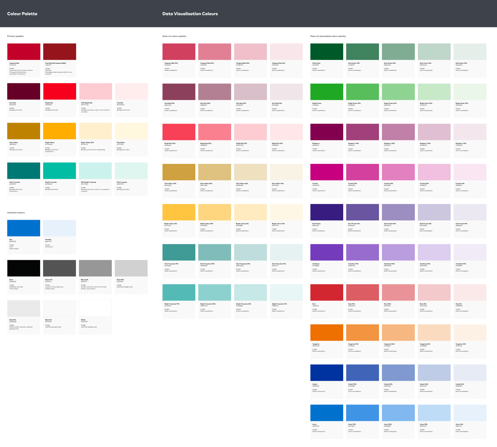
↑ Development of the general interface palette + specific data visualisation palette
4. Documentation
We developed a process (a workflow) and the Council was a great forum to dicuss these matters, keeping them focused and productive.
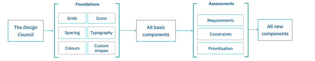
For any components we'd build, the process involved checking requirements against what was available first, then other considerations such as:
- Is it market or project specific? Should a specific person or team be more involved?
- Does it meet our definition of ready?
- Can it be made of existing components?
- What is the priority in the context of other ongoing work, and which capacity do we have?
We made seeking feedback a part of this process, and help understanding by documenting not only the component itself but also how it interacts in context, using rapid prototyping.
Open an example of how we documented a mobile menu, or click on the image below.
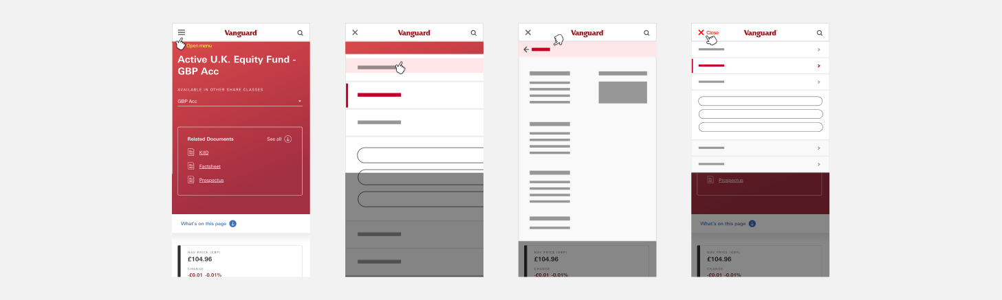
↑ Prototype to illustrate the basic interaction of the mobile menu.
Documentation
This way, we made sure that:
- There was a rationale for the existence of every component.
- Minimised the risk of duplication, while ensuring consistency.
Documentation
This process or protocol also included how to document a component, so every detail would be specified and others would not have to "guess" anything, thus minimising back and forth within the team.
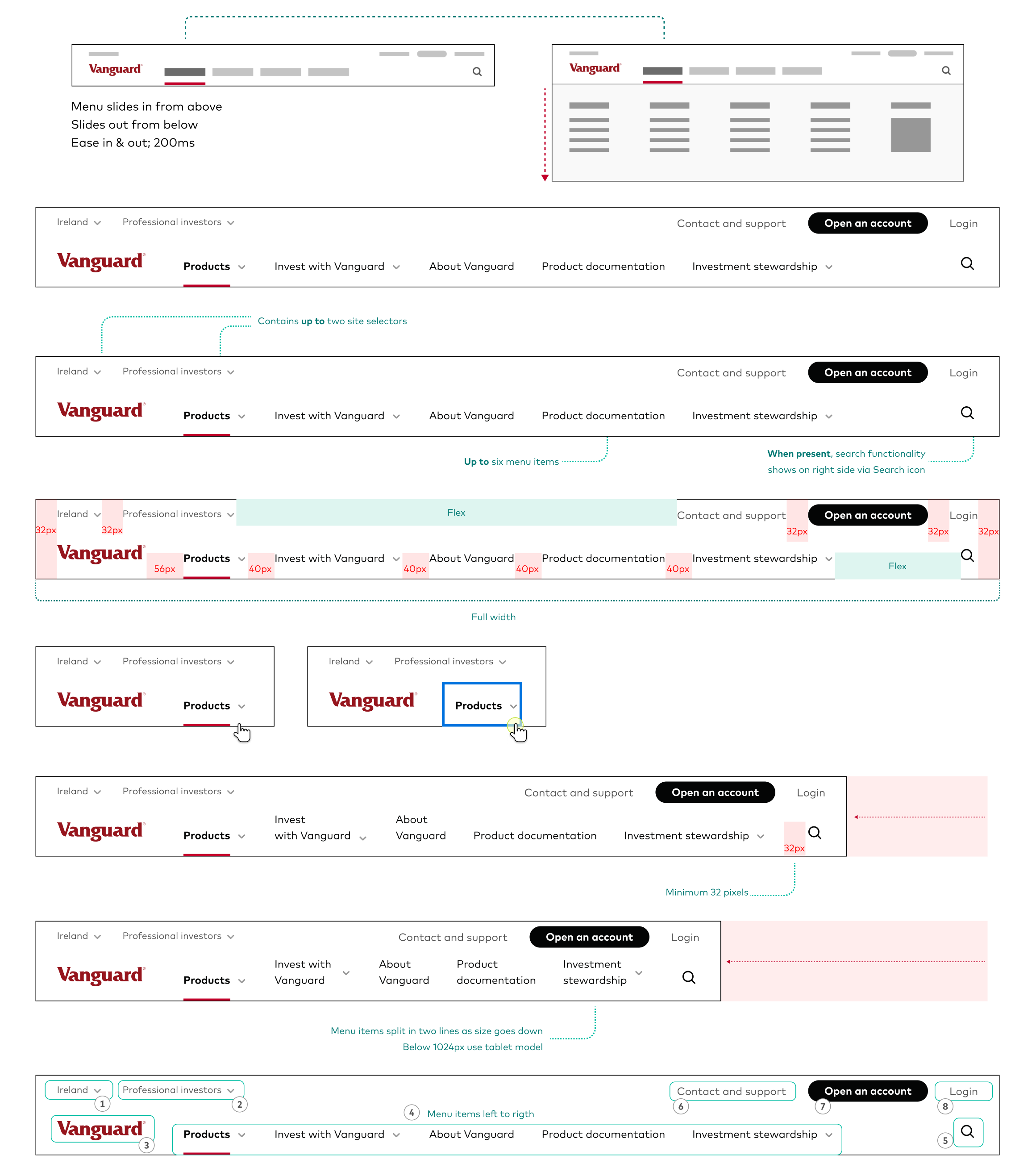
↑ Example of the desktop menu specs.
5. Streamlining
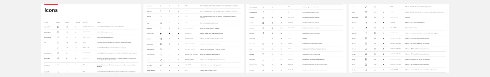
In the case of some other (existing) assets, the work was mostly about simplifying and making things easier for both us and the users.
A good example was the icon set. The old one was far too large and therefore had two main problems: it was hard to navigate (not easy to learn or remember all of them), and it didn't help consistency (as many concepts could be represented by more than one icon).
↑ The image does not even feature 40% of all the icons in the previous set.
↑ A fragment of the simplified icon library.
Working with Alex has been a blast! Even with the challenge of building a complex design system, his knack for creative strategies and careful planning shines through. As a team player, he effortlessly blends his vision with the group's. Plus, he's just a genuinely awesome person, making him an invaluable asset to any creative team.
Lead Product Designer at Vanguard UK
6. Outcomes
Vanguard Europe, in sync with other overseas teams, has a solid set of design foundations: the brand book is very specific on what not to do and how to use all assets, and the EDS (European Design System) is now a shared source of truth for all teams.
A design system is never finished, but after the first phase, the benefits for the organisation are multiple:

↑ The collaboration structure of the design system.
My role
- Creation of EDS, component design and documentation, testing.
- Liaison across overseas teams.
The team
Armando Affonso and Michael Russ (Vanguard Germany), Angelo Schiavone (Vanguard UK), Hamid Islam (Product Manager), Charlie Francis (Frontend Engineer), Sean Glen and Margaret Fulton (Vanguard Australia)